Building A Choropleth Map for England and Wales with Shiny
“A picture is worth a thousand words” - this ancient wisdom especially rings true to me when visualizing complex geographical data.
I’ve been fascinated by how mapping data can instantly reveal patterns that might take pages of statistics to explain. During the COVID-19 pandemic, I created an interactive dashboard that visualized infection cases and vaccination rates across regions in the UK. The stark geographical patterns revealed by these maps could help inform public health responses and resource allocation in real-time. Using my interactive webpage built with R and Shiny, you can select any region in England and Wales (including UK), instantly generate and download the corresponding shapefiles. It’s geographical data at your fingertips!
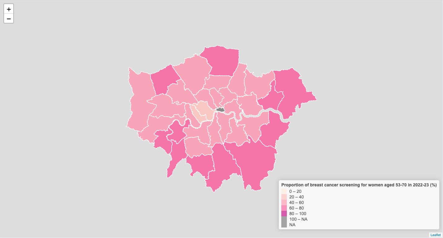
Here’s a powerful example: mapping breast cancer screening rates for women aged 53-70 across London boroughs in 2022-23 (open data from The London Database). In seconds, we can spot areas with high and low screening uptake - the darker color a borough has, the higher screening uptake, and vice versa. This visual insight enables targeted interventions with experimentation - like sending personalized messages to boroughs where screening rates need improvement. With earlier diagnosis through improved screening uptake, we can enhance patient outcomes and potentially reduce the growing treatment waitlists that are impacting so many lives.
But this is just the beginning - maps can uncover hidden societal and economic challenges in ways that spreadsheets simply can’t. Whether it’s healthcare access, educational outcomes, or environmental concerns - seeing the data geographically can spark meaningful actions.
I’m excited to share this tool with you all. What patterns would you want to uncover? What data would you map to drive positive change in your community?