Building a personal spending dashboard with Shiny
Introduction
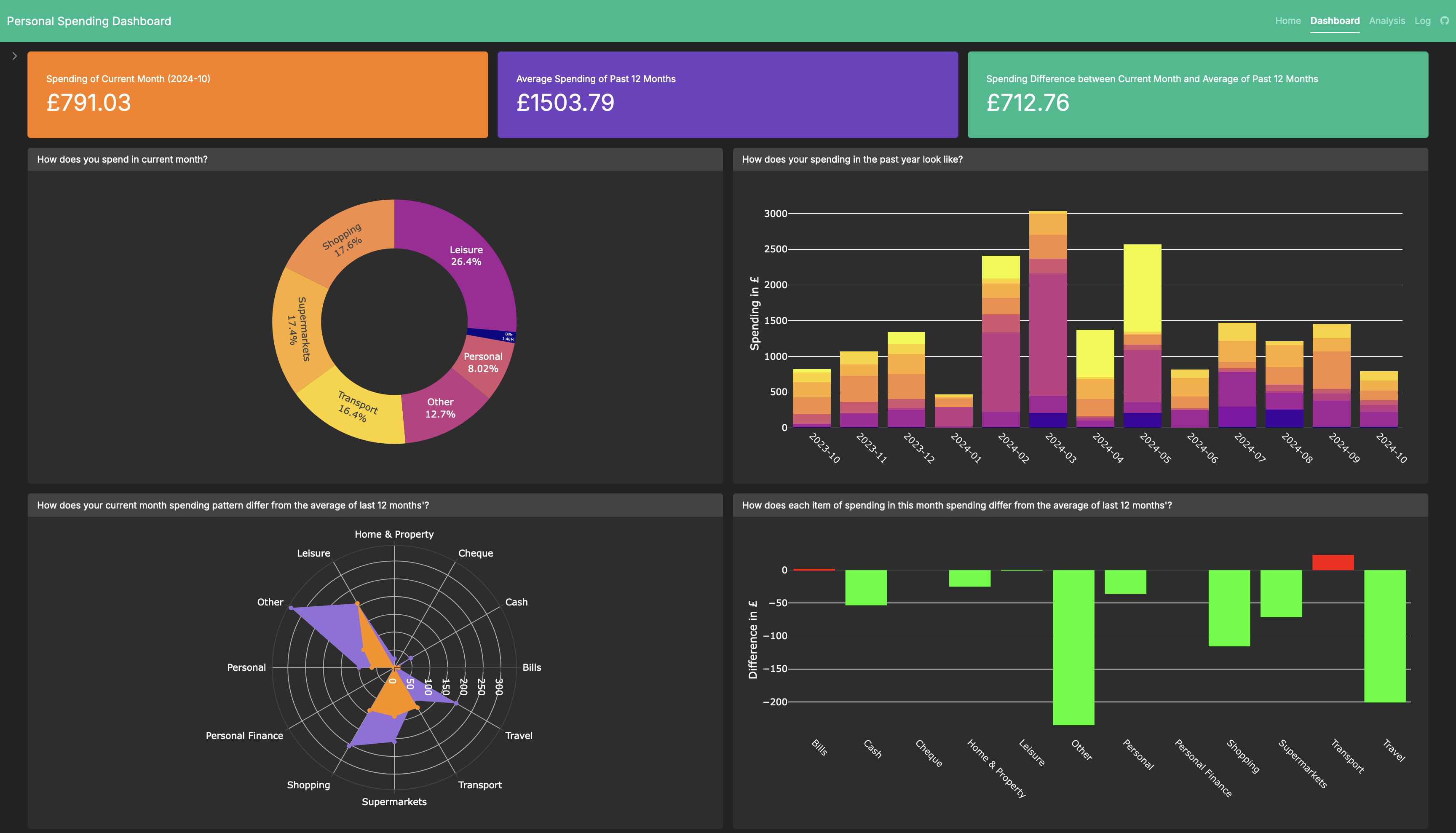
In this post, I present a personal spending dashboard (link) that helps visualize and analyse monthly spending. This Shiny app is for illustration purpose only.

Features
This spending dashboard allows user to upload a csv file with specific format (for more information, see the Home tab in the dashboard). User is required to provide spending of the past 12 months and current month.
This dashboard also provides you valuable information about your spending, such as:
How does your current month’s spending look like? (distribution)
How does your yearly spending trend look like? (trend)
Does your spending pattern in current month differ from that of average of last 12 months’? (overall comparison)
For each spending category, how does your current month’s improve from average of last 12 months’? (per-category comparison)
Background
I had a habit of keeping track of my monthly expenses since I moved to UK. Thankfully, my bank’s mobile app categorized my spending each month, which provides some insights on the distribution of my monthly spending.
Yet, I wondered if I could visualize and analyse how spending in each category varies over time, particularly over the last 12 months or so.
Also, it would be better to have a comparison in spending between current month and a reference group - which the average spending of the last 12 months (self-referencing) seems to do a pretty good job.
With a bit of techniques from Behavioural Science and some questions about monthly spending, I managed to create a draft of this dashboard. I was fortunate to have my friends (Junning and Shantanu) who provided valuable insights in terms of the layout and possibility of how this dashboard could be in the future!
With this spending dashboard, I have a few questions about managing personal spending:
How do users react to absolute amounts vs. percentage changes in spending?
It seems to me that these two might produce different results in the overspending and saving up sections (framing effect). The absolute amount would be a more effective tool than percentage changes when alerting how much a user overspent (in a ‘loss’ framing), simply because the latter would require a user to (i) be aware of what the original spending that is compared to, and (ii) perform a mathematical calculation with the information.Can this dashboard improve financial literacy?
The aim of this dashboard is to provide simple, valuable insights on managing personal spending. Thus, it would be interesting to conduct a within-participant experiment, which is to measure a user’s financial literacy before and after using the dashboard for a period. For instance, we could elicit how well user manages their personal spending with a set of questions before they use this dashboard. We could inform them to use this dashboard weekly, bi-monthly, monthly with reminders. After a period (e.g., three months), we ask them the same set of questions and observe if there are any differences in response.Which is more effective for encouraging savings: personal or community reference points?
In this dashboard, I applied self-referencing in the comparison (current month’s spending with average monthly spending of the 12 last months). One of the prevalent effect in reference-point literature is to comparing it with a community (e.g., you used 50% energy more than what your neighbours used in the last month in nudging energy-saving). To create such community-referencing effect, bank could make use of users’ spending (in anonymous way) to nudge for personal spending. Yet, it seems to me that it would be better and beneficial for banks if users could also be nudged to invest more, with the money they could save up from this.